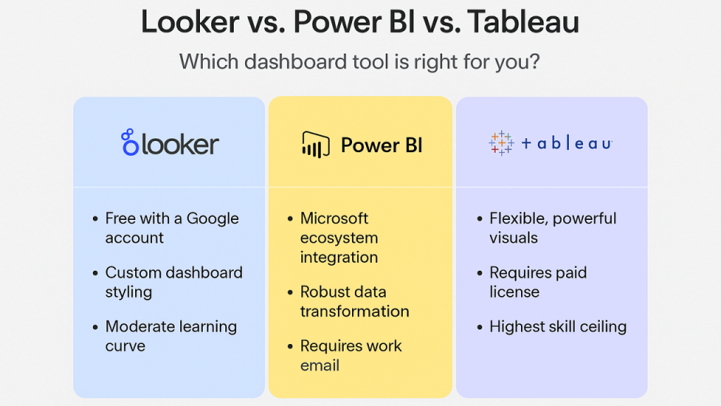
Choosing a BI tool is less about which product is “best” and more about which one matches your team’s skills, your data stack, and how decisions get made. Power BI, Tableau, and Looker can all deliver dashboards and insights, but they differ in how they handle modelling, governance, collaboration, and self-service. If you are comparing tools while planning team upskilling—say, alongside a data analyst course in Chennai—it helps to evaluate them through the lens of day-to-day workflows rather than feature checklists.
What to match: team style, data stack, and governance
Before comparing tools, clarify three practical points:
- Your data environment: Microsoft 365/Azure, mixed tools, or a modern cloud warehouse stack (BigQuery/Snowflake/Redshift).
- How metrics are defined: Do teams agree on “revenue,” “active user,” or “conversion,” or do definitions vary by department?
- Who builds and maintains content: A central BI team, distributed analysts, or product/data engineering owning the semantic layer?
These factors decide whether your BI work becomes scalable and consistent—or turns into many dashboards telling slightly different stories.
Power BI: best for Microsoft-first organisations and fast operational reporting
Power BI is a strong fit when your company already lives in the Microsoft ecosystem (Excel, Teams, SharePoint, Azure). It tends to work especially well for:
- Business and finance teams that need recurring reporting with clear KPIs
- Operations teams tracking daily performance, targets, and exceptions
- Organisations with many Excel-heavy analysts who want a familiar path into BI
Why teams pick it
- Tight integration with Microsoft tools makes sharing and collaboration easier in many workplaces.
- Power Query supports practical data shaping without needing a full engineering workflow.
- DAX is powerful for measures and calculated logic when analysts need flexible KPI definitions.
Where it can be harder
- DAX is powerful but can become complex fast if your model design is weak.
- Large-scale governance and performance require more disciplined modelling and capacity planning.
If your analysts are moving from spreadsheets to dashboards, Power BI often feels like a natural progression—something many learners look for when exploring a data analyst course in Chennai that emphasises real workplace tooling.
Tableau: best for visual exploration and stakeholder-friendly storytelling
Tableau is widely known for enabling rapid visual analysis and strong interactive dashboards. It typically fits well when:
- Business users and analysts need to explore data quickly and ask “why” questions
- Teams value presentation-quality visuals and flexible charting
- Departments want autonomy to build insights without heavy modelling up front
Why teams pick it
- It is excellent for visual exploration—drag, drop, iterate, and discover patterns.
- Dashboards can feel intuitive for stakeholders, especially for ad-hoc analysis and presentations.
- It handles a broad range of sources and is often adopted where multiple systems exist.
Where it can be harder
- Without strong governance, you can get “dashboard sprawl” with inconsistent metrics.
- Enterprise-scale management (permissions, certified data sources, standardised KPIs) needs a clear operating model and ownership.
Tableau often shines in organisations that prioritise exploration and communication—where the dashboard is as much a discussion tool as it is a reporting tool.
Looker: best for governed metrics, modern data stacks, and product analytics
Looker is commonly chosen when teams want a strong semantic layer (a consistent definition of metrics) and deep alignment with modern cloud data warehouses. It fits particularly well for:
- Data teams that want central metric definitions so every dashboard uses the same logic
- Product and growth analytics where consistency across teams matters
- Companies already operating on cloud warehouses and wanting a scalable modelling approach
Why teams pick it
- A model-first approach encourages consistent, reusable metric definitions.
- It supports strong governance: one source of truth for business logic.
- It can work well for embedded analytics in internal tools or customer-facing products.
Where it can be harder
- The modelling layer requires specialised skills and tighter collaboration with data engineering.
- Teams expecting freeform drag-and-drop exploration may find it less flexible without the right setup.
For teams building a mature analytics practice—often a goal after completing a data analyst course in Chennai and moving into product or platform analytics—Looker’s governance can reduce confusion and rework over time.
A simple “which team should choose what” guide
- Choose Power BI if your organisation is Microsoft-centric, you need quick operational dashboards, and you want wide adoption with manageable learning curves.
- Choose Tableau if your team prioritises fast exploration, strong data storytelling, and stakeholder-friendly visuals across mixed data sources.
- Choose Looker if you need governed, consistent metrics across teams, have a modern warehouse-centric architecture, and can invest in modelling discipline.
Final thoughts
Power BI, Tableau, and Looker are all capable tools, but they reward different operating styles. Power BI often wins for Microsoft-aligned reporting at scale, Tableau excels when visual exploration drives decision-making, and Looker fits best when governed metrics and a central semantic layer are the backbone of analytics. The best choice is the one your team can operate confidently, maintain consistently, and scale responsibly—especially as your analysts grow beyond dashboards into deeper analytics after a data analyst course in Chennai.


